9 common business card professional design mistakes to avoid

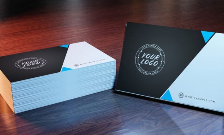
Your business card is known as an extension of your brand. It is often ignored, but they have an important job to do. Your business card professional design is what helps it in getting the job done. Having a well-designed business card can make you appear reputable to potential clients. It lets them be aware that you are an honorable company that can assist them with your products and services.
Digitally swapping contact details is often seen as impersonal. Therefore, ensure your card represents you as well as your business.
Here is the list of common mistakes that need to be avoided during the process of design.
Common mistakes of business card
- Outdated information
- Misprint and typos
- Image quality
- Leaving Out Contact Information
- Typography Mistakes
- Lack of Branding
- Poor-Quality Card Stock
- Visual Clutter
- Not Utilizing the Back of the Card
The standard size of a business card is 2″ x 3.5″, which is not much space to sell yourself. Therefore, it is important to utilize the area wisely to draw the attention of the individual receiving the card. An unprofessional-looking and poorly-designed card can driveway clients who genuinely need your services or products.
-
Outdated information
If you were given a business card that had an outdated email address, will you consider them valuable? What about if they had crossed out particular information on the business card and re-written it in ink? What impression will that give to prospects or clients?
Business cards are amazingly affordable. Don’t be scared to reuse old business cards that have outdated information written on them, and order new ones.
-
Misprint and typos
Typos and grammatical errors tell your clients that you don’t care about the details of running your business. Of course, every individual makes an occasional mistake, but it’s a fair expectation for a client to expect that you recheck your business card before giving them.
-
Image quality
Avoid poor image quality as well. Use high-resolution pictures that don’t end up blurry or pixelated on your final design. For a better understanding of images quality, consider 300 dpi pictures.
-
Leaving out contact information.
We all are aware that a business card is a small size. Still, it continues to be a powerful and useful marketing tool that allows you to connect with all clients, customers, prospects, and fellow business owners, while promoting your brand.
Before you visual, the details of your business card professional design, (text, features, colors, etc.) ensure you include the most essential information.
- Your Name
- Title/Specialization or Job Title
- Company Address
- Website
- Email Contact
- Phone Number
- Social Media Handles
Only consider including the social media public username that you as well as your company is business-related active on. Clients love having different ways to communicate with a business.
-
Typography mistakes
It does not matter how good is a design, if your client can’t read the card print, it is quite much unusable. Don’t use hard-to-read typography on your business card. If you try to be too creative, you can end up becoming a curse when your clients are not able to read the words. Also, ensure you experiment with the font size. For instance, if you have an old demographic, ensure to use simplified, large text. Also, don’t use small fonts to fit in information.
-
Lack of branding
Building your brand is vital. If you are wanting to make an unforgettable impression, play is safe, and utilize highly general visuals on your business card. If you want your prospect to recall you, use the different branding that makes you stand out from the rest.
Your design must include a similar color used for your business website and logo. By properly branding your business card, you can build recognition and encourage clients to associate you with the services or products they need.
-
Poor-quality card stock
It is important to select the right card stock. A card can sure have an awesome design and purpose. But, when they are in the recipients’ hands, you will want to ensure they are not flimsy and feather-light. By having a good-quality business card professional design, you can indicate that your business has good services and products. Best card stocks are: Velvet laminated, sill laminated, and painted edge cards. You can also select plastic business cards.
-
Visual clutter
When thinking about the graphics, images, text, and patterns, ensure the design is not so busy. Not only it can appear cluttered, but your information can even get lost.
Three or four images on your business card are probably too much. If you find yourself coinciding pictures with text, then this can also be too much.
Sufficient white space assists the recipients in focusing on the information instead of design. Visual clutter can certainly cause readers to give up and move on.
-
Not utilizing the back of the card
The back of the business card is often forgotten or neglected in the design process. Not using the back of the card is a missing opportunity to include additional information. Whether it’s social media accounts, QR codes, business slogans, product statistics, a special coupon, or inspirational quotes, there are many artistic ways to utilize the back of a card to make a positive and lasting impression.


